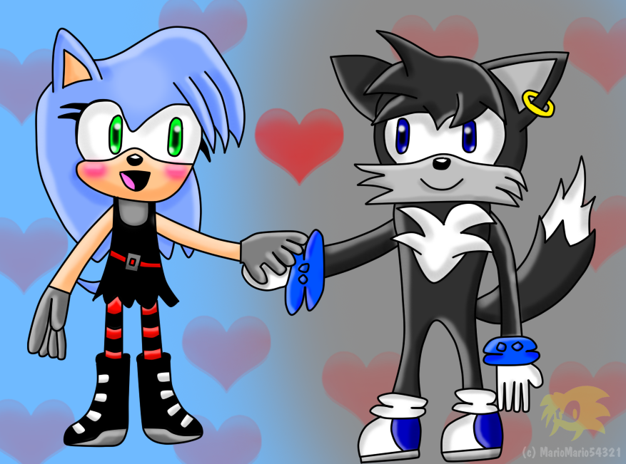
Well, before I go out on all of the negatives, I've got to start off with the positives, and tell you what I like about this picture. First of all, I would like to mention that I do think that the line art in this picture is nice. It's nice, it's clean, and there aren't that many clarity issues with it, the only exception being with the black dress, but that's not really a problem. I also want to take note that the shading style itself looks pretty nice... at some points. That's the first thing I want to talk about,
<img src="
e.deviantart.net/emoticons/b/b…" width="10" height="10" alt="

" title="Bullet; Red"/><img src="
e.deviantart.net/emoticons/b/b…" width="10" height="10" alt="

" title="Bullet; Blue"/><img src="
e.deviantart.net/emoticons/b/b…" width="10" height="10" alt="
" title="Bullet; Red"/> The Shading <img src="
e.deviantart.net/emoticons/b/b…" width="10" height="10" alt="
" title="Bullet; Red"/><img src="
e.deviantart.net/emoticons/b/b…" width="10" height="10" alt="
" title="Bullet; Blue"/><img src="
e.deviantart.net/emoticons/b/b…" width="10" height="10" alt="
" title="Bullet; Red"/>
<img src="
e.deviantart.net/emoticons/b/b…" width="10" height="10" alt="

" title="Bullet; Green"/> The shading looks pretty nice, and I think that it has a pretty nice deal to it, and the way you decided to shade it looks pretty nice, my complaint, however, is that it has no sense of direction. There's no real... place the sun is coming from or hitting, it looks like there are multiple suns place all throughout the picture. There needs to be only one sun spot. Another thing, is that the shading isn't... dark enough. The shading is a little too light for it's kind, not to mention it doesn't really act like shading. It's good to refer to the "shading" ball when it comes to your highlights and shadows of a picture, all objects should follow a similar matter. For example, the girl on the left has a bunch of highlighting on her hair, specifically the part on the left side. However, not too far from her right is the shading, it appears to only stay at her mouth, and doesn't seem to pay much attention to the fact that her body is there as well and should cast a shadow. Also in her sicks you have highlighting even though it's directly underneath her clothes. There should be a shadow there, not a highlight. It's not like she has the sun in her pants or something. Work more on the shading, I suggest studying proper shading from more "professional" artists if you want some good types of shading techniques to follow.
<img src="
e.deviantart.net/emoticons/b/b…" width="10" height="10" alt="
" title="Bullet; Red"/><img src="
e.deviantart.net/emoticons/b/b…" width="10" height="10" alt="
" title="Bullet; Blue"/><img src="
e.deviantart.net/emoticons/b/b…" width="10" height="10" alt="
" title="Bullet; Red"/> The Anatomy <img src="
e.deviantart.net/emoticons/b/b…" width="10" height="10" alt="
" title="Bullet; Red"/><img src="
e.deviantart.net/emoticons/b/b…" width="10" height="10" alt="
" title="Bullet; Blue"/><img src="
e.deviantart.net/emoticons/b/b…" width="10" height="10" alt="
" title="Bullet; Red"/>
<img src="
e.deviantart.net/emoticons/b/b…" width="10" height="10" alt="

" title="Bullet; Purple"/> Well... not to sound rude but, you need a whole lot of work on the anatomy. One thing I really want to point out, is the direction of the shoes both of those characters have. They seem to be facing whatever direction they choose and aren't really attached to the body. This actually can make sense with the fox's shoe, I'm referring to the leg and shoe on the very right. If you notice, the sock to shoe connection, is not made at all, almost as if his ankle is really deformed. Not to mention, the direction his body is facing, having feet being forced to stand like that, would get pretty hard to do after a while. Not to mention your body is still required to turn just to be able to properly have your feet do that. The girl's feet however, not so much of a problem, but really need to be facing towards us a lot more. And speaking of the girl, she looks like she has a really weird deformed lump at the very top of her head. I realize that it's supposed to be her bangs, but that's not even supposed to be like that. As far as anatomy goes, you did a much nicer job with the female than the male. I know most of the Sonic Characters do not have necks, but there should at least be something that shoes there's a possibility of them having one. Take a look at Sonic for example. Even though you see no Neck, his body rounds itself back into the center of the head. The male here does not show it. Also his arms aren't even attached to his body and are just limping around with his thumb being backwards. The arms can be saved for another time, but there's absolutely no bone structure in the arms. Not bending points or anything. It's just like rubber arms pretty much and is something you should probably fix.
I can't wait to see more art from you, and I hope you think of this more as something to look back upon instead of me doing nothing but saying the picture is bad. Overall, this is a good picture, I give it a 3.5/5


 and
and  's fan characters!
") ), but they broke up
), but they broke up ") so now
so now ")

